Amazon sales still are flat--0 people have actually BOUGHT the book on amazon. Plenty of people have SEEN the book on amazon--it shows the book at #5 on the searches (much better than the #18 that it used to be), but still the sales are slow. If you want to buy my book, either buy it direct from me if you want a signed copy and live in the local area (if you don't, email me at dawson@vosburgs.org and we can work something out) or buy it off of Amazon. Until I get a few amazon sales, Lulu sales are restricted.
Well, not really--it's just I wish that you would buy it off of Amazon instead. ;)
Anyway, I've been mulling over the idea of a writers' retreat either this summer or some other time of break when I have money. My invites are as follows:
- Christopher Paolini
- Jeff Kinney
- Jeremy Robinson
- Eoin Colfer
Pretty short list right now, but I'm guessing it would be a lot of fun, going to some remote and beautiful place with computers and typing our brains out. That would be fun. If you hadn't noticed, these are my favorite authors. Well, the ones that are still alive, that is. Tolkien, CS Lewis, and Charles Dickens certainly cannot attend.
That's still in the ideas stage, though. Just a thought of something I would like to do.
Now, I will rant about something that has nothing to do with books: the Pepsi logo redesign. In case you haven't seen a vending machine recently, this is what it looks like.

My question is: WHY??? Let's start off with my basic and biggest complaint.
They changed the freaking Pepsi globe.
Yep. They made the one of the most recognizable logos in the world into something that looks like a cheap Aldi grocery store brand. Apparently, that white crap is supposed to be a smile. WhatEVER. That wasn't what the logo was supposed to look like in the first place. It looks more like a Barack Obama advertisement.
Hey, that'd be kinda funny--put an Obama O on the Pepsi can.
Also, the stupid lowercase font. Everyone's trying to have the "thinnest font around." It looks like they took a good, solid-looking sans serif font and sliced everything off until it was this ugly creature that I would leave by the side of the road in a heartbeat.
Sierra Mist is unforgivable. It looks like that Walmart Mountain Dew knockoff called Rocky Mist. Seriously, go check it out. They look very similar. Besides the stupid font and stupid gaussian blur on the "Mist" part. That's what REALLY makes it look off-brand.
Then there's my least favorite: the Mountain Dew.
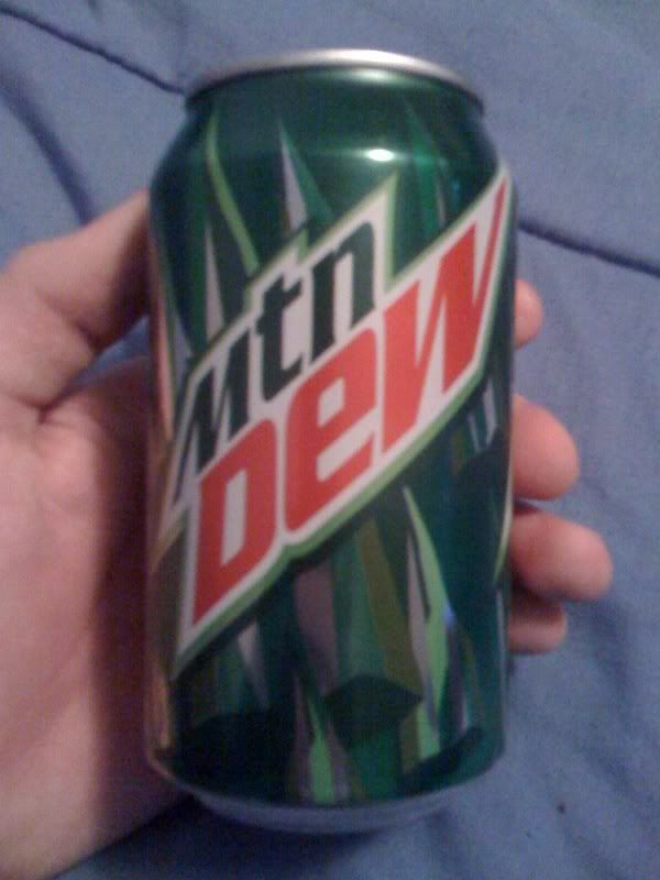
This is just irredeemable. Mtn Dew? What the heck? Whose idea was this? No. No. You're trying to keep up with a trend that died out years ago. Taking vowels out of words does NOT make them cooler. No.
Also, the logo really turns off the demographic. This kind of logo--especially the background--does not attract young people. It attracts its old main audience: hillbillies.
Okay, I've said enough. I'll be posting more when updates come along. Or tommorrow, whichever comes first.
Dawson
Look at me, all my pain and misery, this is all your fault.
ReplyDeleteWhat?
ReplyDelete